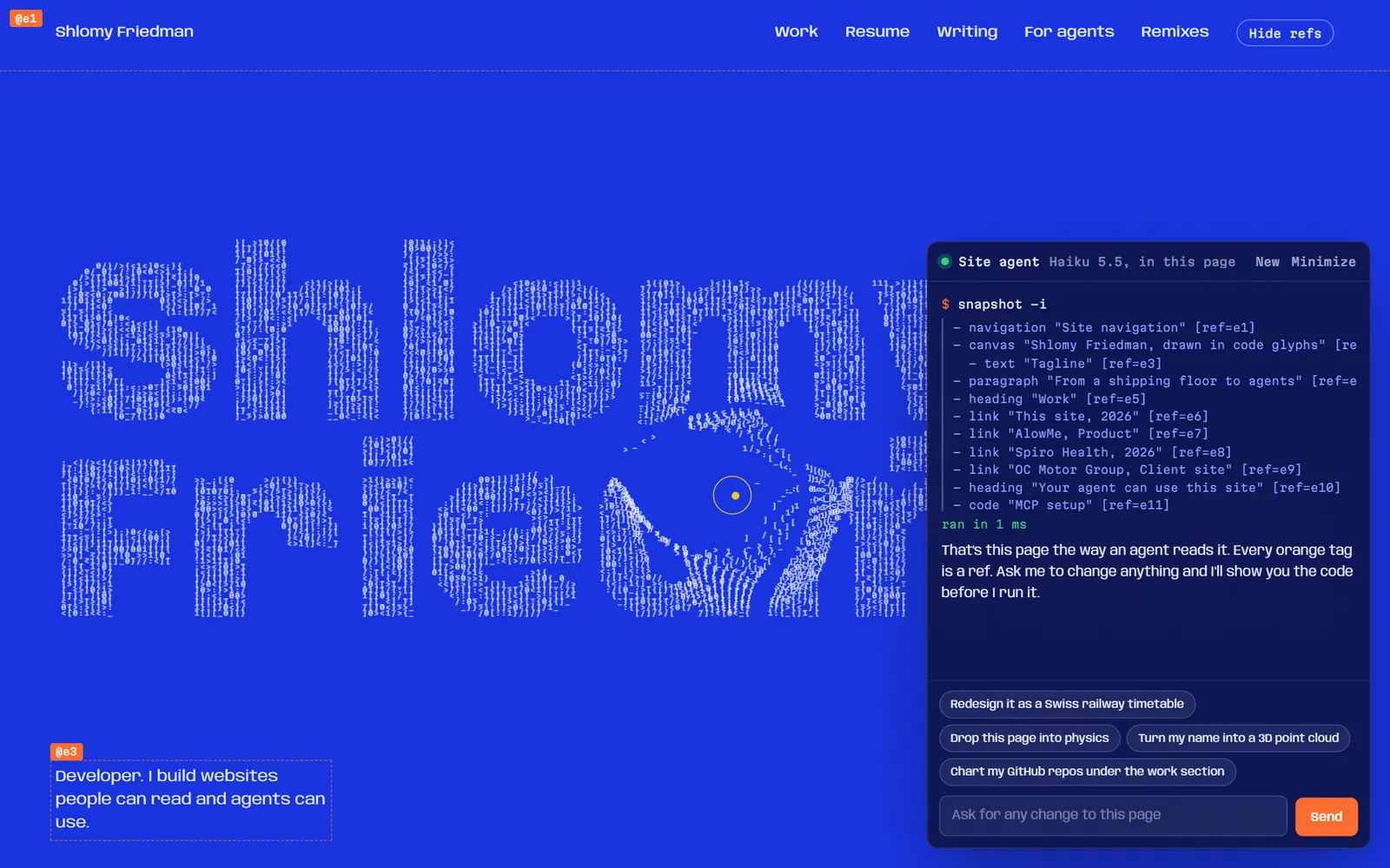
I haven't updated my site in a while, and I want to do something bold and new with it while losing the generic AI-built look. Let's explore a few directions first. I'd like the site to showcase WebMCP and a real MCP server, plus some playful UI that visitors can customize through live Claude Haiku calls.
Watch it work1 note, 5 tool calls
I'll start by looking at what the site is today, so the ideas fit what's already there.
- ran commands ×3loaded toolssearched the web
I went through the repo. Here's what I'd do, starting with why it reads as AI-built right now.
What makes it look AI-built
Most of it comes from specific defaults that AI tools reach for:
- Outfit font with an animated gradient on your name (
home.module.css.heroName) - Three blurred background blobs in orange, purple and cyan (
ambientOrb1-3) - See-through "glass" cards with a glow effect on every block
- A "✨ Welcome to my portfolio" badge above a centered hero with two buttons
- A stat row: "3+ Years / 5+ Projects / ∞ Ideas"
- Skill pills sitting on percentage levels
- Small things: the README is still the T3 starter text, and Mantine v5 is forcing
legacy-peer-depson React 19
Changing colors won't fix this. The layout and the choice of components need to change too.
The main idea: an MCP server that is also your portfolio
All three of your ideas fit one concept: the site works as a site for people and as an API for AI agents. It shows MCP work by being an MCP server, not by describing one.
1. A remote MCP server at /mcp
- A Next.js route handler using the MCP SDK's streamable HTTP transport, running on Vercel.
- Tools:
get_projects,get_experience,search_blog,check_availability, andsend_message(rate-limited, and it asks for confirmation). - The showcase page has an "Add to Claude / Cursor" config snippet you can copy, plus a live inspector: a log of real tool calls with private details removed, so visitors watch agents using your site.
2. WebMCP: the same tools, inside the page
- Each page registers its tools in the browser, checks whether the browser supports this, and shows a quiet badge like "this page exposes 5 tools to your browser's agent."
- An "x-ray" toggle outlines each part of the page that's backed by a tool, so visitors can see how the page maps to the agent's API.
- Caveat: support is still early. Only Chrome Canary or an origin trial (around Chrome 149+) has it. The API also moved from
navigator.modelContexttodocument.modelContext, and older guides still show the old name. You'd need a fallback, which item 3 covers.
(I took "wmcp" to mean WebMCP. Tell me if you meant something else.)
3. Live UI changes with Haiku (claude-haiku-5-5)
- "Restyle this site" box: a visitor types something like "Bloomberg terminal" or "1997 GeoCities." Haiku returns a limited JSON theme (colors, type scale, spacing, corner radius, layout variant). You already use zod, which would check it before it's applied through CSS variables. It never returns raw CSS or HTML, so it's safe and the site can't break. Themes can be shared as a URL, and the best ones go in a gallery.
- Content that changes for the reader: "explain this for a recruiter / a CTO / a 10-year-old." Haiku picks from a fixed set of your components and fills in their content.
- Fallback demo for WebMCP: a small Haiku agent in the page calls the same WebMCP tools, so the demo works in every browser.
- This could also replace your 6 hand-built brand portals: the portal look gets generated live instead of maintained by hand.
- Cost control: rate-limit with Vercel KV or Upstash, cache results by prompt, and keep
max_tokenssmall. Haiku is cheap enough for this.
Three looks to choose from
| Look | Feel | |
|---|---|---|
| A. Instrument panel | Monospace, dense grid, little decoration, status readouts | Feels like a working tool. Fits the MCP idea best. |
| B. Editorial | Big serif headlines, paper and ink colors, one strong accent, magazine layout | Looks the most hand-made and personal. |
| C. Lab notebook | Swiss grid, each project shown as an "experiment" with specs and a live demo | Keeps the demos as the focus. |
My recommendation is A or C, with the Haiku restyler as the fun part. A plain default look also makes the restyles stand out more.
Order of work
- Clean up: remove Mantine, react-slick and leva, finish moving to the App Router, and build the new design system.
- Build the MCP server and inspector page. This is the strongest portfolio piece.
- Add the Haiku restyler. This is the part people will share.
- Add WebMCP tools and the x-ray mode, with the Haiku agent as the fallback.
Questions for you
- Which look: A, B, C, or a mix?
- Should the easter eggs and brand portals stay? I'd keep 2–3 of the best and cut the rest.
- Are you OK putting an Anthropic API key on the server for the Haiku features?
If it helps you decide, I can make quick HTML mockups of the three looks before changing any code.
Sources: